As part of a wide-ranging programme to revamp how it approaches designing a station, and how it can be more sustainable and built to last, Network Rail has looked to prefabrication. Richard Wilcock finds out more.
In this article:
As part of a wide-ranging programme to revamp how it approaches designing a station, and how it can be more sustainable and built to last, Network Rail has looked to prefabrication. Richard Wilcock finds out more.
In this article:
- Railway station designs have evolved, reflecting societal changes, from Victorian grandeur to post-war modernism and cost-effective prefabrication.
- Network Rail's HUB Station project aims to standardize station design with modular, sustainable, and community-focused elements for future needs.
- Sustainability and adaptability are central to the HUB Station concept, ensuring efficiency while enhancing passenger experience and local engagement.
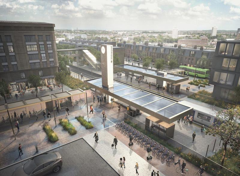
The railway station has been through many design phases over the years. Changing political and societal moods have also affected how they have been built and used.
The Victorians saw railway stations as beacons for a golden age of transport - with typical grandeur and built for an industrial empire that had the railway front and centre.
Each city, town and even (in some cases) village stations mirrored the vision of the empire at the time.
Moving people was the railway’s primary focus, requiring larger stations designed to cope with the ever-increasing demand.
And while the cities went for largesse, smaller branch stations had ornate ticket hall designs, large canopies, and intricate brickwork with several waiting areas.
As the Second World War ended, and when British Railways was formed in 1948, the UK looked ahead to an uncertain economic future, struggling to find its place in the world. The railways followed suit, and so did the stations.
Stations became functional. The ‘Mid-50s Modernism’ design took hold, and where possible British Rail looked towards clean, straight lines, built with simple but solid materials that moved away from brick, adopting concrete instead. It wasn’t pre-fabrication as we know it, but it was the beginning of a rethink.
Smaller stations looked towards simplicity even more - and none more so than Harlow Town station in Essex and Coventry in the West Midlands.
Harlow at the time was a new town, built up throughout the 1950s as part of the first wave of the government’s New Towns Act, which led to exponential growth in the area. The population rocketed from 4,500 in 1947 to 54,000 by 1961.
The new station opened in 1960 and was renamed Harlow Town (it was previously called Burnt Mill) to correctly position it as the heart of the town’s expansion.
Its design represented a sign of the changing times, an example of how British post-war architecture was finding its feet. It has a simple structural design with little extravagance, as well as a double-height booking hall that gives an impression of space where space is in fact at a premium. Much of it still exists - simplicity in design triumphed over unnecessary modernisation.
This approach evolved even further with Coventry railway station, which reopened after a rebuild in 1962. Coventry, ruthlessly bombed during the Second World War, was ready for reimagining - and the rebuilt station opened as part of British Rail’s massive West Coast Main Line modernisation and electrification programme.
For some, Coventry’s railway station is a brutalist eyesore that looks more like a civic centre, rather than the hub of a busy interchange station.
Designed by a team headed by modernist architect William Robert Headley, the station was partly an experiment for how modernism could fit into the fabric of Britain’s architecture.
The ticket hall is a concrete box, surrounded by glass on three sides, only jutting out of its harsh confines at the front where it acts as a canopy.
Inside, simplicity in design gives way to simplicity in navigation, with Platform 1 easily identified and viewable from the ticket hall. A straight walk for many passengers.
Even its signage was simple. Using British Railways’ newly developed Rail Alphabet that Margeret Calvert had designed, passengers could clearly see where each of the four new platforms were.
It was a stark departure from the railway station designs from the Victorian and pre-war periods - a sign of a country looking forwards again.
But modernisation on the network didn’t just stretch to the larger terminal stations or new builds. As the cost of maintaining older stations became prohibitive, BR began looking at ways of saving money. And this cost-cutting exercise meant branch line and mid-size stations were in line for rebuilding.
Headley took his ideas to some of the redesigned stations along BR’s London Midland section during the 1960s, with East Didsbury station in Greater Manchester the best example of this design - dubbed ‘Mod-X’.
The stations along this route are essentially prefabricated rectangles, with an open layout inside. Headley’s influence on design can be seen with the large canopy roof that juts out towards the platform edge.
The suburban stations on the lines within Greater Manchester are now dotted with the ‘Mod-X’ design, and they have largely existed without much modification or change.
In the South, BR had a similar issue. It needed to replace 400 stations which were proving impossible to maintain. However, there was little money to make sweeping changes or to redesign all of them, so it turned to a method already in existence.
Clasp (Consortium of Local Authorities Special Programme) originated in the 1950s as a way of adopting prefabricated methods to public sector buildings. Devised partially to save money, it was a variation of the ‘Mod-X’ method.
A steel and concrete frame was adopted, with small windows immediately below the roof. The canopy was typically wooden and the roof flat. Inside, there was not much else.
CLASP was adopted mainly across the Southern Region, with more than 30 stations using the method between 1965 and 1971.
Daniel Wright, transport writer and author of the popular blog The Beauty of Transport, says that CLASP stations haven’t really stood the test of time: “The issue with CLASP was that it was designed for school gymnasiums, not for railway stations. It was designed for function to the optimal degree, and they were not very pretty to look at. They were also fitted out very cheaply.”
CLASP was a sign of the times, it seems. A quick solution designed to be taken down as quickly as they went up.
Wright agrees: “They have a lifespan, and I guess they are well past that now. But they are cheap to maintain. It’s probably why they are still on the network.”
As the 1970s and 1980s progressed, other designs became more popular.
The ‘D70’ method adopted a large modular glass design. The D70 is essentially a glass box, intended to give the impression of space and to provide better natural light (a criticism often levelled at CLASP buildings). It also used better glass to insulate buildings more efficiently.
It proved popular, with both the Southern and Eastern regions adopting the design on many of its stations throughout these decades.
From there, further prefabricated designs that were little more than bus shelters were adopted on many metro or suburban lines - largely to save money.
As the need for amenities such as ticket halls, toilets and waiting rooms disappeared for many smaller stations, so did the need for considered design, with the now-privatised operators keen where needed to keep it minimal.
As ever, cost has played a part in the decline of station design over the last 20 years. This includes pre-fabrication, and bespoke design.
For Wright, scaling a modular and prefabricated design presents difficulties: “If we were going to renew every station next year, you’d need 2,600 buildings. But we’d also need to define how every station should be, which is never going to happen. So, the market is quite small for really considered design, which is why you end up with some of the designs we’ve seen.”
However, the true value of a railway station to its community is much greater than that of a bus shelter.
Today, the future of small and medium-sized stations is up for discussion. For the past five years, Network Rail and the Design Council have been consulting with the industry and the wider public about what the future of a railway station could look like in the next 20 years.
It started by working with Arup in 2018, conducting research with industry stakeholders. It then staged a competition which attracted more than over 200 entries, and which was eventually won by the architects 7N.
“We must ask ourselves: how do we want people to wait? We’ve seen many designs over the years, and we’ve reached a point where efficiency is taking away from the actual parts of the station,” says Frank Anatole, Network Rail’s Principal Architect who has been one of the key figures involved in the project.
“What we’ve been doing is trying to install good practice, with the design as well as looking at what the passenger wants. We need to be getting the public and communities more engaged in the railways. And to do that, you need to provide facilities and places that people want to not just go to, but also spend time there and give it some more social value.”
The project is called a HUB Station - a clue to the vision that NR is hoping to put into place for the next 20 years of standardised design.
HUB Station has taken its cues from the 1950s and the post-modern movement, a period where modularisation really made its mark.
However, as history taught British Rail and now Network Rail, designing stations at scale is a difficult thing to do.
Anatole explains: “I think something like 85% are small to medium stations, so there’s a huge market. And we thought if we don’t generate this standard, and it’s a benchmark, no one’s going to do it.”
The benchmark Anatole and his team have come up with is a design that incorporates many of the features you would typically expect from a small to medium-sized station.
It has a tower, a station canopy and other facilities. But alongside that, it has what Anatole describes as a “welcome mat” - a long, covered walkway which can have multiple uses for sustainability, as well as socially.
Anatole describes it as a bridge from the public realm into the station environment, and a reimagined version of an entrance hall that you would typically expect. The “welcome mat” is envisioned as being flexible in size and purpose, with Anatole saying that the design could support retail, or amenities such as a bike park or parcel pick-up points.
Waiting areas in the hub design are known as ‘pods’. It is hoped they provide a better experience, which to Anatole is crucial to the overall project.
“When you see pictures of people huddled under basically a bus shelter at stations, I think: why do we do that?
“Sometimes it can be much more cost-effective just to build a very simple canopy which can supplement the waiting pods.”
The pods, like most other aspects, can be added or subtracted depending on need. This feature is a considered part of the project that Network Rail has developed to what Anatole describes as “a high level of detail and design assurance”, and which is now ready to be released to the market.
The design has a ‘kit of parts’ and a design manual to guide companies on how the station should be built and eventually look.
Network Rail hopes that the modular ‘kit-of-parts’ solution will help operators overcome issues with scalability.
Structural specifications and standardised drawings, as well as guidance for deviation to meet local needs, have also been covered during the past few years.
And the design has attracted interest, with Transport for Wales looking at the concept for five new stations it is hoping to build (Cardiff East, Newport West, Somerton, Llanwern, and Magor and Undy) while development has just begun at Wickford in Essex.
No Network Rail project, be it station design, renewals or electrification, can progress without considering sustainability. HUB Station is no different.
“Obviously there is an environmental challenge to make our stations greener. And this isn’t in a passive way where we put in a few pot plants or partially build in timber,” says Anatole.
Many of the past designs or structures have seen sustainability being treated with little respect. But HUB Station has the subject at its heart, making it a key part of why it could define station design for a long time.
Anatole adds: “I don’t think many of the past projects had treated the environment in the way that it has been treated within this one. There is a lot of galvanised metal in stations of this size, and almost at every step sustainability was a driving factor. How can this last? How can we build sustainably as well as ensuring it is aesthetically pleasing.
“It was a challenge, but we demanded it of ourselves, because the industry and the public demand it.”
This approach ensured that low-carbon recyclable materials form a key part of the HUB Station design manual, as well as utilising the canopy (a part of the station which Anatole thinks gets a “bad rap”) for solar power - which would power lighting, customer information and ticketing systems.
Anatole alludes to the fact that during the period of consultation, the public made its feelings known on the importance of sustainability. It forced the design team to look at ways of making the ‘welcome mat’ more sustainable, as well as better defending the design against potential flooding.
Network Rail has tried to avoid adding to potential future cost in a project designed to demonstrate efficiency and simplicity. But it is acutely aware that no two stations (let alone communities) are the same. Ensuring that all these elements are catered for meant prioritising needs.
“We had to think on how to structure the design. Do you build out from the actual platform itself, and then into the sort of the welcome mat area?” notes Anatole.
“We also had to think intermodal transport in and around the station layout, and how to manage and mitigate that.”
As well as managing intermodal transport within the design and allowing for local needs, the project has also looked at the different sites - including those that feature in cuttings, embankments, and other unusual layouts.
It has done this by adjusting canopy types, increasing options for waiting areas, and using materials that offer flexibility.
The project has studied the environment a station sits in, rather than in isolation, and again asked the question of how a railway station can add social value as well as serve its intended purpose.
The result is a considered, cost-efficient design that can evolve and suit the network for the next couple of decades.
Login to continue reading
Or register with RAIL to keep up-to-date with the latest news, insight and opinion.






Login to comment
Comments
No comments have been made yet.